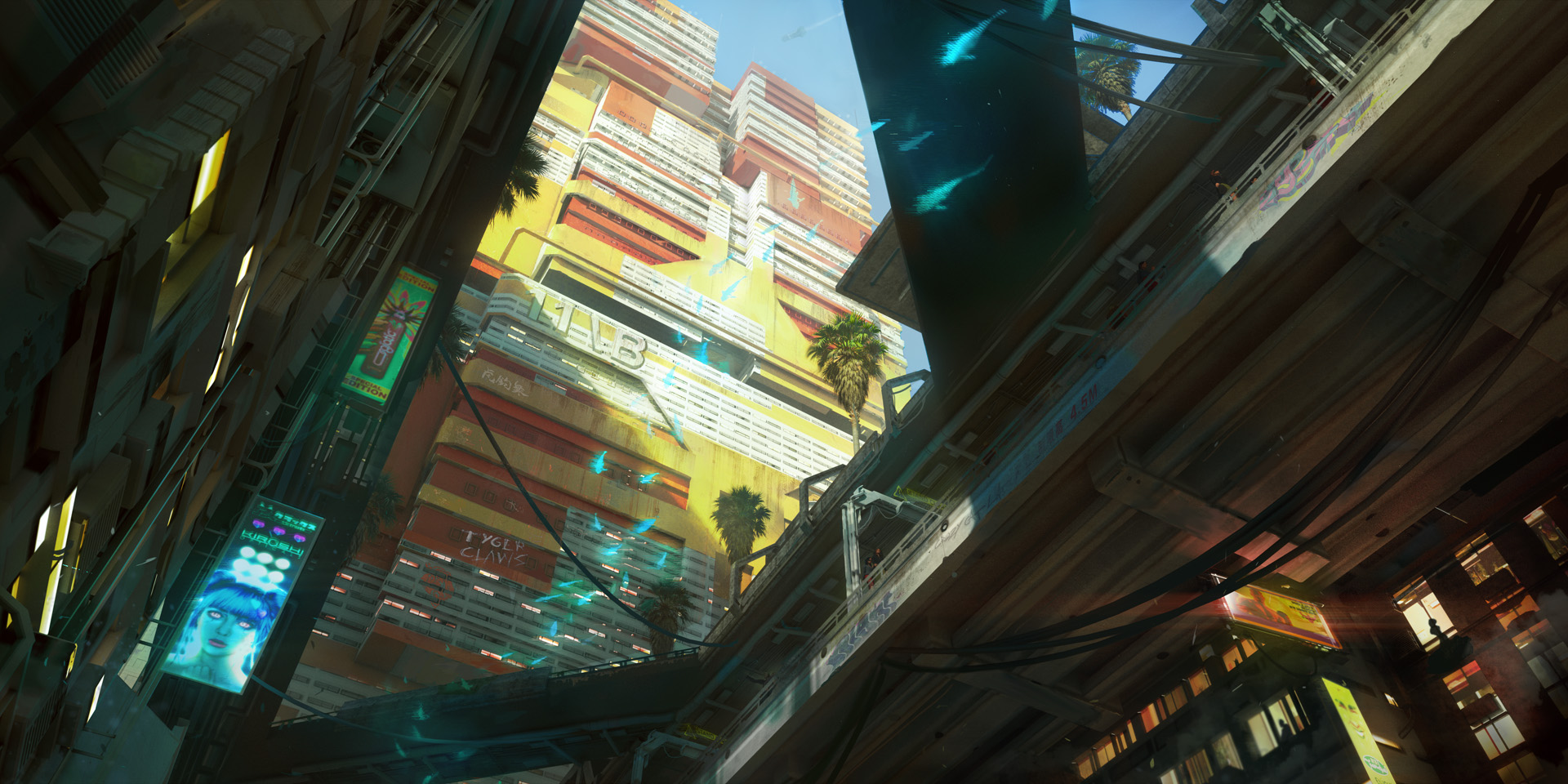
Most recently, the official Twitter account twote some new concept art of Westbrook, an area where the disgustingly wealthy (or at least people with a decent line of credit) go to flash the cash. If it’s anything like the concept art, Westbrook is going to be awful. But, you know, amazing. As we learned in the Wire stream, Night City has been designed with a whole fictional, cultural history in mind, with the different time periods and areas of the city contributing different styles and architecture. It’s fascinating stuff, and was explained to me last year by senior concept artist Marthe Jonkers. One of the things I really love about these new concept screens is that you can see clear examples of what Jonkers talked about. For example, the second of four style epochs in Night City’s history was a kind of “style over substance” era, where buildings were designed with rounded edges and people used brighter colours, predominantly pink and yellow. So when we look at this big yellow apartment block…
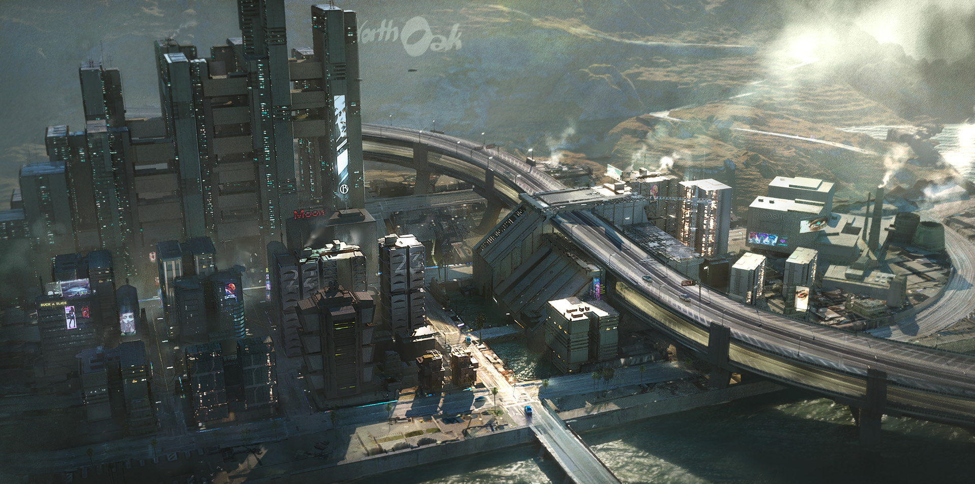
Isn’t that cool? It’s like a sort of neo-70s vibe that almost looks retro in the context of Night City, especially when you compare it to the simulated hologram fish swimming in the air below it. Jonkers also described buildings in areas with a strong megacorp presence as being “neo-militaristic”. “You see a lot of colours that are white and black and metal, it’s very slick,” she said. And I think you can see that flavour in this second image, showing angular skyscrapers that do kind of make me think of guns.
This image in particular makes me think of downtown LA, too. LA natives: I cannot begin to explain how weird it is to finally see LA for the first time when you’ve only seen it in films and TV until that point. I mean, I’m not to have a massive go at LA, because inequality is obviously present in every major city anywhere in the world. But they don’t all have award-winning musicals about how great they are. The weirdest of all the three bits of concept art is one depicting a massive, luxury casino, with more waterfalls than actual walls. I’ve used it as the header up at the top of the article, but I’ve also cropped in the weird casino below so you can see it in all its mad detail. Katharine said it “looks like the cross-section of a whale’s mouth,” which is very accurate. This is the most futuristic of the art shared, because it has proper gravity-defying architecture. It’s good to know that this is something the devs are keeping in mind, so I can walk around Night City going, “The future is now!!” like a time traveller from the 1800s.
But importantly, it still looks like a vision of the future as defined by the past. The offset layers and glass everywhere style of architecture means that the casino building compares favourably to the futurist visions of the 50s and 60s. You know: “Welcome to the world of tomorrow! The distant future, the year 2000!” Which is cool, because that’s still what a lot of people think of when they think of futuristic sci-fi today. Obviously you can’t draw 1:1 parallels between the real world and Night City because of the devs have created their own fictional past for it, but inequality is a big theme in cyberpunk texts, where amazing technology exists but isn’t widely available if you’re poor. It’s interesting to see how that translates into the design of Night City itself, but I’m more intrigued to see how (and if) those themes are drawn out and dealt with in the finished product. But right now I am like: that casino is amazing, it looks like a spaceship crashed into a golf course, obviously that is the kind of stupid fucking thing rich people would build.


